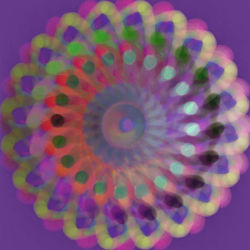
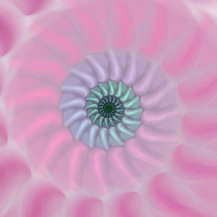
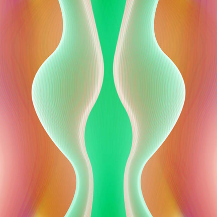
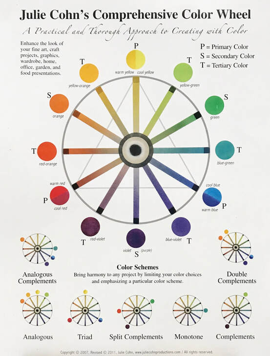
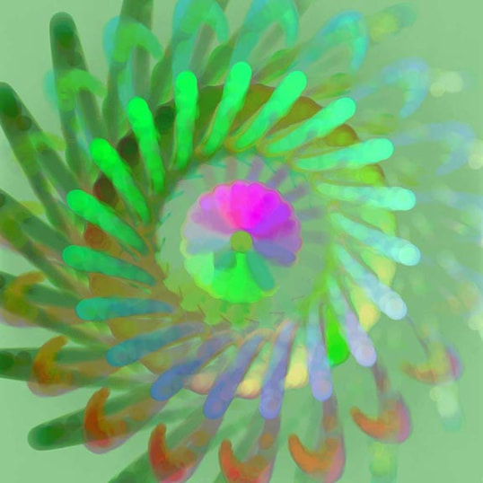
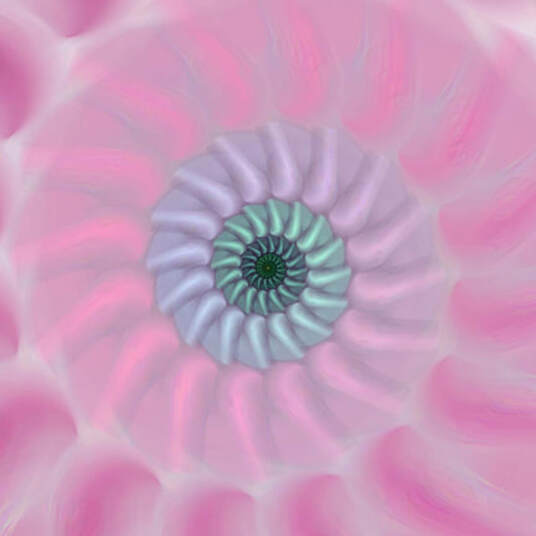
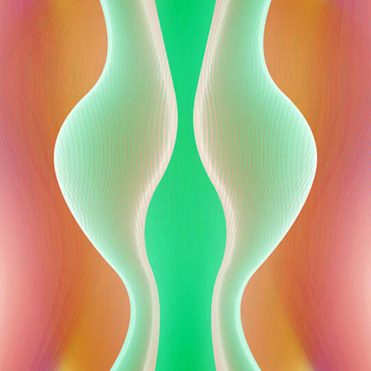
Understanding ColorI would like to start by explaining a color wheel that I have developed. I’m going to share with you how the colors in the color wheel are used in Sara’s art and why the art affects my mood in a certain way. Each of us responds uniquely to color. However, there are some universal ways of using color that can influence our emotions in similar ways. The primary colors that make all other colors are red, yellow and blue. When mixed together, two colors at a time, they make secondary colors - orange, green, and violet. Notice on this color wheel what is directly across red, yellow and blue. The secondary colors! Red - Green Yellow – Purple Blue - Orange When you put a primary color next to its opposite secondary color, they make each other look even brighter than they look on a neutral background. They complement each other, in other words, in this chummy relationship they invigorate each other, and thus are called complements or complementary colors. Complementary colors produce a "zing" when placed right next to each other. Yet, they elicit a very different effect when they are mixed together unevenly. For instance, when you mix a little bit of red into a lot of green, the green becomes darker, like a forest green. If you take a touch of orange, or even better yet, a deep orange called burnt sienna, and mix it into a lot of sapphire or ultramarine blue, the blue becomes darker and not as bright.. Let’s take a look at the color relationships in Sara’s generative art, art that is made with code on the computer. Not only are her metal prints filled with beautiful complementary combinations, they also come in glossy form, which brings out their color even more. Vibrating Color in Sara Frucht's ArtThe darker greens in this artwork, from Sara's Dot Mandala Series called Dot Mandala 5, were made by combining the complements red and green, with less red applied to more green to create a dark green. The bright green spokes in front of the darker green pop out at us because the dark green behind them contrast to make them look luminous. All the greens in this work become even more exciting with the bright pink complementary tone in the center. Pink is in the red family, so would be considered a complement of green. If you look closely, there is even another complementary pair on the lower section, yellow, and purple! From my perspective, this piece has a lot of movement in it, with a wonderful synchronicity between the various brightly colored and the very subtle spokes. I feel energized and ready for a great day. This image is from Sara‘s Dot Mandala series, called Dot Mandala 4. I find the colors mesmerizing and keep wanting to follow different parts of the wheel, getting lost in complementary colors, such as red and green, and violet and yellow. The overall warm tone of red violet Is a near-complement to green. In fact, red violet is considered a tertiary color, and its opposite tertiary color is yellow-green on the color wheel, a very exciting color combination when placed right next to each other. Even though exact opposite colors on the wheel look great together, you can see by this example that colors near red, such as the tertiary, red -violet can also look great next to green, which is very close to its exact complementary color. This artwork, called Spiralrect 5 feels like a lullaby, lulling me into a restful state. Do you see the near-complementary colors? They are more subtle than what we see in the artwork I just showed you. The blue green in the center is almost a complement to the pinks that surround it. It also seems as though most of the colors are imbued with some white, which give an effect of calm and serenity. Without the blue green in the center, evolving out of slowly changing pinks and soft purples, this artwork would not pull me in so closely. I’m saving this one for last for a good reason. The design and the color are quite alluring. From Sara's Wave Series, this is called Waves 5. The shape reminds me of a figure, and the subtle coloration of greens that were affected by bits of red to make them less bright surround a bright green and white that glow and glimmer. The deeper oranges and reds are a bit darker, and so provide a stunning backdrop for an exquisite emerging form. I would love to hear your response to these works of art. How are you affected by the color? What is your favorite color? Do you know why? Can you explain how it makes you feel? Ways to Use Color in Your Own Life I hope that you can gain great appreciation, not only for Sara’s art, but for all the color that you see around you every day. You will find the complementary colors in so many things, from your choice of flowers to put in a colorful vase, what you choose to put in a salad to bring out the red and green complementary colors; the belt, bracelet, or scarf that you decide to wear. May your world of color become a greater part of your day, and may your appreciation for color bring you much joy! Here is a link to Sara's Gallery on Sustaining Arts: https://sustaining-arts-store.myshopify.com/collections/sara-frucht
6 Comments
Michelle
2/20/2024 03:03:30 pm
Great read! I learned so much
Reply
Cassie
2/27/2024 08:14:19 pm
Very educational and added excitement to Sara's pieces. I was thinking a series by Sara would be nice. Sustaining is so much more meaningful, and fun done creatively.
Reply
3/18/2024 02:26:21 pm
Hi Julie,
Reply
4/7/2024 12:38:03 pm
Loved your blog! Saving it for future to reread when struggling with color!
Reply
Leave a Reply. |
AuthorJulie Cohn Categories
All
|



 RSS Feed